A Guide on How to Reduce Bounce Rate

When someone lands on your site and leaves after viewing just one page, they're sending a clear message: "This isn't what I was looking for." That single-page visit is a bounce, and it's often a direct result of slow load times, a confusing layout, or content that just doesn't connect. If you want visitors to stick around, you have to address these core issues first.
What Bounce Rate Really Means for Your Website
Let's get straight to the point. Your bounce rate is more than just a number on a dashboard; it’s a grade on your website's first impression. A high bounce rate is a red flag, signaling a major disconnect between the promise that brought someone to your site and the reality they found.
This isn't just an abstract problem. It translates directly into lost sales, missed sign-ups, and a weaker online presence. Over time, search engines can even interpret a high bounce rate as a sign of low quality, potentially hurting your rankings.
Think of it as a quick health check for your site's most critical functions:
- Content Relevance: Is the content on your page actually delivering what your ad, social post, or search snippet promised?
- User Experience (UX): Can people find what they need easily? Is the design clean, or is it cluttered and frustrating?
- Technical Performance: How fast does your page load? Does it work seamlessly on a phone?
A high bounce rate tells a story of missed opportunities. It's a clear signal that something in your user's journey is broken, whether that's a lost sale, a potential subscriber, or simply a chance to build a little brand trust.
Before you panic about your numbers, it's helpful to know what’s typical. Bounce rates can vary wildly depending on the type of website, as this infographic illustrates.
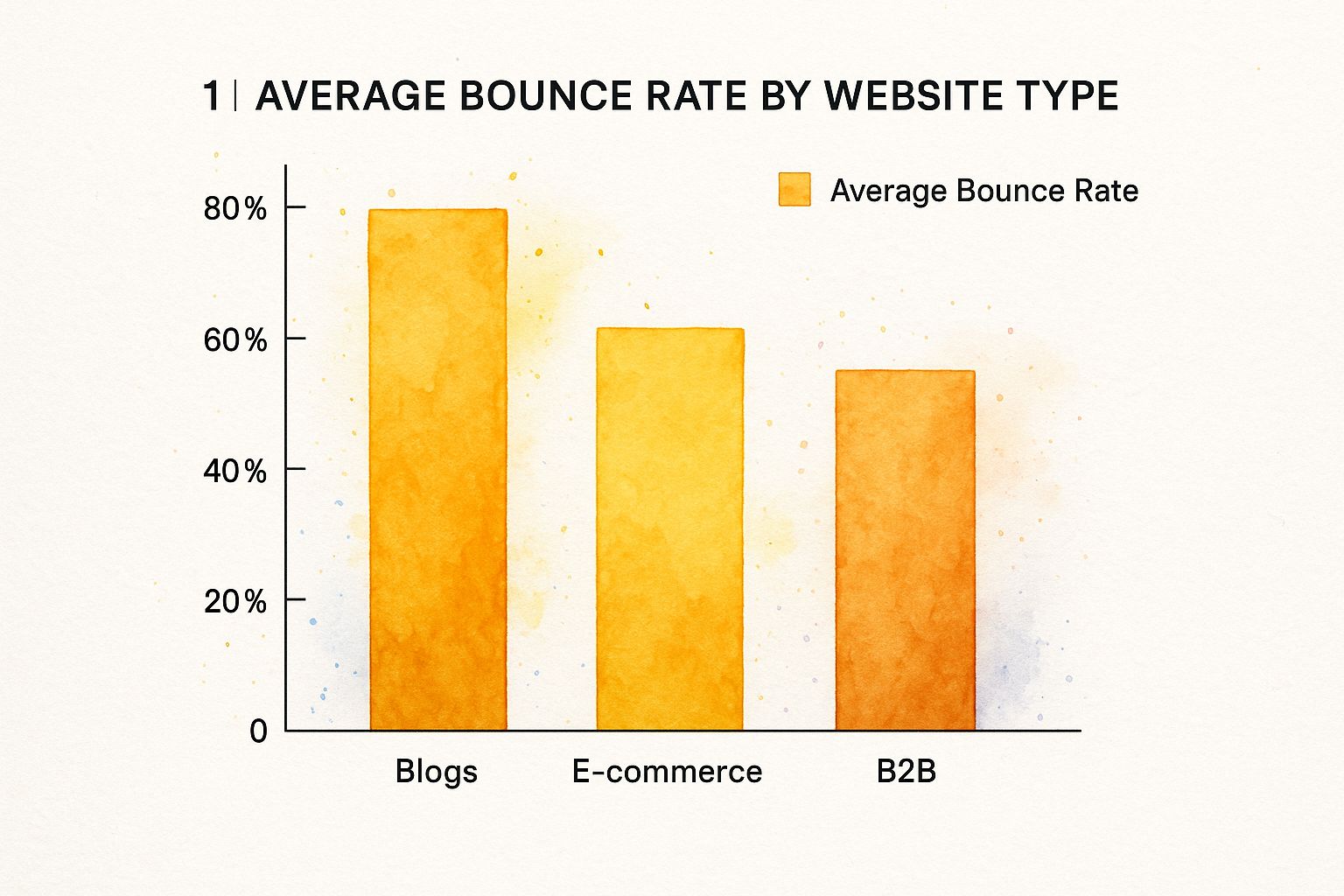
As you can see, user expectations are different everywhere. Someone reading a blog might be perfectly happy finding a single answer and leaving, while an e-commerce shopper is generally expected to browse a few different products before making a decision.
To help you pinpoint exactly where things might be going wrong on your own site, I've put together a quick diagnostic table. It covers the most common reasons visitors leave and what you can do about them.
Common Bounce Rate Culprits and Their Solutions
| Problem Area | Common Cause | Strategic Solution |
|---|---|---|
| Performance | Slow page load speed (over 3 seconds) | Optimize images, enable browser caching, and use a CDN. |
| Content | Content doesn't match the user's search intent | Align your page title, meta description, and on-page content with target keywords. |
| UX/UI | Confusing navigation or cluttered design | Simplify your menu, use clear calls-to-action, and ensure a clean, mobile-friendly layout. |
| Engagement | A single block of text with no clear next step | Break up text with headings and images, and add internal links to related content. |
This table is a great starting point for troubleshooting. By identifying the root cause, you can stop guessing and start implementing targeted fixes that actually work.
Why Context Is Everything
Remember, a "high" bounce rate isn't always a bad thing—context is king. For example, a reference site like Wikipedia might have a high bounce rate because users find the exact information they need and then leave satisfied. On the other hand, data shows YouTube has a low bounce rate of around 34.29% because its entire model is built on keeping you watching the next video. Contrast that with a platform like Twitter, where rates can hit 71.46% because its primary function is to send users to external links.
To get a real handle on this, you need to track your metrics accurately. If you haven't already, setting up a tool like Google Analytics is essential; you can find out more in our guide on how to add Google Analytics to your website. Ultimately, understanding your bounce rate is a key part of the bigger picture: implementing effective strategies to improve website conversion rate.
Craft a User Experience That Invites Exploration

Think of your website as a physical store. When someone walks in, what’s their first impression? Is it a well-lit space with clear aisles, or a cluttered maze that makes them want to turn around and leave? A frustrating digital experience is the quickest way to send someone packing, so your goal should be to design a journey that feels so intuitive they can’t help but stick around and explore.
This all starts with your navigation menu. A bloated menu with dozens of choices is a classic case of analysis paralysis. Instead, ruthlessly cut it down to the essentials. If you’re running an e-commerce shop, a new visitor needs to immediately spot "Men," "Women," and "Sale"—not get lost in a confusing dropdown of niche sub-brands.
Simplify and Guide the User Journey
When it comes to keeping people on your site, clarity is your best friend. Every single element on the page needs to have a purpose, gently nudging the user toward the next logical step. This is where a solid visual hierarchy becomes so important.
A good visual hierarchy uses size, color, and placement to signal what matters most. Your main headline should be the biggest thing on the page. Your primary call-to-action (CTA) button should pop with a contrasting color. This isn't just about making things look pretty; it's about creating a path of least resistance.
If you need a refresher, diving into an article on the importance of good website design really drives home how much a clean layout influences user trust from the very first second.
A great user experience isn't about adding more features; it's about removing friction. The easier you make it for someone to find what they need, the longer they will stay.
For example, I've seen clients completely overhaul their site architecture, focusing on a simpler interface and less cluttered menus. The result? Bounce rates dropped because visitors could finally find what they were looking for without having to think too hard.
Actionable Design Tips for Lowering Bounce Rate
Ready to put this into practice? Here are a few things you can do right now to improve your site’s user experience and encourage visitors to stay a while:
- Embrace White Space: Resist the urge to fill every pixel. White space (or negative space) gives your content room to breathe, reduces cognitive load, and makes your key messages and CTAs stand out.
- Write Compelling Calls-to-Action: Ditch generic CTAs like "Submit" or "Click Here." Instead, focus on the value. "Get Your Free Quote" or "Start My 7-Day Trial" tells users exactly what they’ll get, making the click much more appealing.
- Focus on Readability: Use clean, legible fonts with plenty of contrast against the background. Nobody wants to squint. And please, break up those massive walls of text into short, scannable paragraphs of just a few sentences.
Create Content That People Actually Want to Read
Let's be honest: even with a stunning website design, people will hit the back button in a heartbeat if your content is boring or irrelevant. Compelling content isn't just a nice-to-have; it's your primary weapon against a high bounce rate. The goal is simple: meet the visitor's expectations the second they land on the page and prove you have the answer they're searching for.
A brilliant way to achieve this is by using the inverted pyramid style. It’s a classic journalism trick for a reason. You put the most important information—the key takeaway or the solution—right at the very top. Don't make people dig for the good stuff. Give it to them immediately.
Hook Them From the First Sentence
Your opening paragraph is your one shot to convince a visitor to stick around. It has to be a powerful hook that speaks directly to their problem or curiosity. A vague, bland introduction is a guaranteed recipe for a bounce.
Kick things off with a startling statistic, an empathetic question, or a bold promise. For example, instead of a dry "This article is about content marketing," try something more engaging like, "What if you could slash your bounce rate by 50% just by rewriting your first paragraph?" This kind of benefit-focused opener immediately grabs attention and keeps them reading.
A visitor makes the stay-or-go decision in just a few seconds. Your headline and opening hook are all that stand between you and another bounced session. Make them count.
To really master this, it's worth digging into effective SEO and content marketing strategies that turn browsers into readers.
Break Down That Wall of Text
Have you ever landed on a page that was just one massive block of text? You probably left immediately. Modern online readers are scanners, not deep readers. You have to make your content easy on the eyes.
- Smart Subheadings: Use clear, descriptive H3s and H4s to organize your content into bite-sized, logical chunks. This lets readers jump straight to the sections that interest them most.
- Bullet Points and Numbered Lists: When you have a series of tips, features, or steps, format them as a list (like this one!). It's instantly more readable and digestible.
- Rich Multimedia: Break up the monotony of text by embedding relevant videos, helpful infographics, or even a well-placed GIF. These visuals can illustrate a point far better than words alone.
In the end, these content tweaks do more than just keep people on your page. They create a clear, easy-to-follow path that guides visitors toward taking action. This is the foundation of turning a casual visitor into a genuine lead, which is why you might also want to check out our guide on how to improve website conversion rates.
Build a Web of Smart Internal Links

A dead-end page is a bounce waiting to happen. When a visitor finishes an article and has nowhere else to go, you've essentially shown them the door. A thoughtful internal linking strategy is the most effective way to turn that single page view into a full-blown session.
This isn't about stuffing your content with random links. It's about strategically building a logical web that connects related topics, guiding visitors from one piece of helpful information to the next. By creating these pathways, you're not only giving your bounce rate a much-needed haircut but also showing search engines how your content fits together, which boosts your authority.
Crafting Anchor Text That Actually Works
The real magic of internal linking lies in compelling anchor text. It's time to retire generic phrases like "click here" or "read more." Your link text needs to be descriptive and make a clear promise of what's on the other side.
- Get Specific: Instead of linking "our services," link a more detailed phrase like "explore our no-code landing page features." The user knows exactly what they're getting.
- Keep it Natural: The link should flow with the sentence, not stick out like a sore thumb. Think of it as a helpful, in-context suggestion.
- Mix It Up: Using the exact same anchor text for the same link over and over again can look spammy to both users and search engines. Use natural variations to keep things fresh.
An effective internal link is like a great tour guide. It anticipates what your visitor might want to see next and points them in the right direction before they even have to ask.
Let's say you have a blog post about building a simple website. A user reading it might start wondering about getting a domain. That's your cue. You can link a phrase like "choosing a custom domain" directly to an article you've written that explains that exact process. You've just solved a problem they didn't even know they had yet.
This approach genuinely works. There's a powerful correlation between low bounce rates and high pages-per-visit. In fact, data shows that websites with the lowest bounce rates often have visitors who stick around to view 7 to 8 pages. Compare that to high-bounce-rate sites, where users typically leave after just one or two pages. It’s clear proof that a well-linked site keeps people engaged. You can discover more insights on these website statistics to see the data for yourself.
Optimize for Speed and Mobile-First Users
Let's be blunt: a slow website is a conversion killer. We live in a world of short attention spans, and if your page doesn't load almost instantly, you've already lost a huge chunk of your audience. They'll just hit the back button and find a competitor who respects their time.
This isn't just a feeling; the data backs it up. Studies show that nearly 70% of consumers are less likely to buy from a brand if they have a poor website experience, and slowness is a primary culprit. That immediate exit is what drives up your bounce rate, and it happens before anyone even sees your fantastic content or products.
And don't forget about mobile. With nearly 60% of all web traffic coming from mobile devices, your site must be fast and easy to use on a small screen. For many e-commerce stores, that number is even higher.
Fast, Fluid, and Focused
So, how do you fix it? The good news is that optimizing for speed doesn't have to be a massive technical headache. A few smart adjustments can make a world of difference. The goal is to get your content in front of people before they even have a chance to get impatient.
Here are a few things I always recommend focusing on first:
- Shrink Your Images: This is the big one. Huge, high-resolution images are the number one cause of slow-loading pages. You can use tools to compress them dramatically without sacrificing much visual quality.
- Use Browser Caching: This is a clever trick that tells a visitor's browser to save parts of your site, like your logo and core files. The next time they visit, the page snaps into view instantly because their device already has what it needs.
- Keep Your Code Clean: Bloated, messy code takes longer for browsers to read and render. This can get technical, but if you're using a modern platform like Linkero, this is often handled for you, giving you a speedy foundation from the get-go.
A fast website is a sign of respect for your visitor's time. By delivering a quick, responsive experience, you're building trust from the very first second and giving them a reason to stay.
A responsive design is table stakes now. Your website absolutely must look and work great on any screen, from a wide desktop monitor to a tiny smartphone. Think about that mobile view specifically. Are the buttons big enough for a thumb to tap? Can people read the text without pinching and zooming?
If you want to get serious about tracking your site's performance, check out our guide on the most important website performance metrics to monitor.
Bounce Rate FAQs: Your Questions Answered
If you're digging into your website's analytics, the term "bounce rate" probably keeps popping up. It can feel a bit confusing at first, but let's clear up some of the most common questions people have when they start trying to tackle it.
What Is a Good Bounce Rate?
Honestly, there’s no magic number. A "good" bounce rate really depends on your industry and what kind of website you're running. For instance, an e-commerce store might aim for something around 35%, while a news blog could see rates closer to 44% and still be doing just fine.
The key is to focus on your own trends rather than comparing yourself to some vague industry average. Are you improving over time? That's what matters. However, if your bounce rate is creeping above 60%, that’s a pretty clear sign something is off and it's time to take a closer look at your content, user experience, or page performance.
Why Is My Bounce Rate So High?
A sky-high bounce rate almost always comes down to one thing: a mismatch in expectations. A visitor clicked a link expecting one thing and your page delivered something else entirely. Maybe your ad promised a huge sale, but the landing page made them hunt for the discount code.
A few other common culprits I see all the time include:
- Glacially Slow Load Times: In a world of instant gratification, every second counts. If your page doesn't load in a snap, a good chunk of your visitors will be gone before they even see what you have to offer.
- A Clunky Mobile Experience: Most people are browsing on their phones. If your site is a pain to use on a small screen—forcing them to pinch, zoom, and squint—they'll just give up.
- A Confusing Page Layout: A cluttered design with no obvious next step is a recipe for bounces. When people don't know what to do, they do the easiest thing: hit the back button.
Think of a high bounce rate as direct, unfiltered feedback. It’s not just a number on a dashboard; it’s your audience telling you that something about your page—the speed, the design, or the message itself—is creating a roadblock.
Does Bounce Rate Affect SEO?
Yes, it does, though maybe not in the way you think. Google hasn't explicitly said, "bounce rate is a direct ranking factor," but it’s a powerful signal of user satisfaction. Search engines are in the business of giving people the best, most relevant answers.
If users consistently click on your page from a search result and then immediately "bounce" back to the search page, it tells Google your content probably wasn't a great match for that query. Over time, this can nudge your rankings down as Google prioritizes pages that users actually stick around on. The good news? When you fix the things that lower your bounce rate (like creating better content and speeding up your site), you're also doing great things for your SEO.
Ready to build a lightning-fast, beautiful landing page that makes visitors want to stick around? With Linkero, you can design a stunning, no-code website with intuitive blocks and built-in SEO tools, all optimized to reduce bounce rate from day one. Start creating your page for free on linke.ro.


